5 Examples of Good User Experience on Apartment Websites
One of the worst things that can happen when someone visits your website is when they can’t find what they’re looking for, so they leave. Bad user experience can send potential renters running to your competitors.
In fact, if your website content and design doesn’t meet the needs of your users,
79% of them will leave and search for something else. That’s a lot of missed opportunities and, more importantly, missed potential leads.
Not only this, but
Google will soon be placing more emphasis on user experience, which will have a big impact on SEO in the future.
If you’re a little bit overwhelmed wondering what “good” and “bad” user experience is, let’s start with a few examples of some really great user experience on apartment websites.
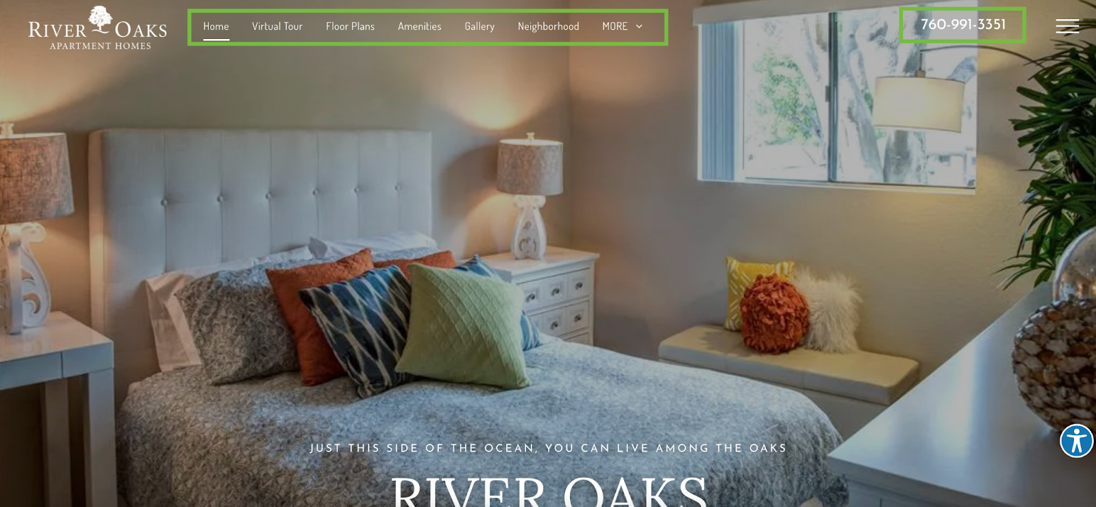
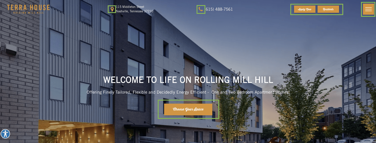
1. Navigation Bar and Phone Number at the Top of the Page
This website does a great job of showcasing perhaps the most important element for anyone visiting your site - the navigation bar. Without it, visitors would have to scroll endlessly to find the pages they’re looking for. Or worse, they would simply leave the website and never return.
Make sure to include the pages your potential renters view the most - floor plans, amenities, gallery, neighborhood, virtual tours, and contact. And be sure to add your phone number at the top too, that way they have a way to contact you as soon as they enter your site - so they don’t have to go searching for it.
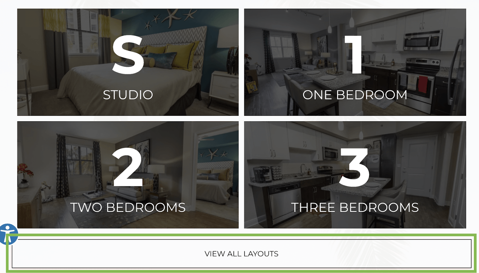
2. Relevant CTAs on the Homepage
CTAs are powerful tools - when incorporated correctly. No website visitor wants to be presented with a million buttons upon scrolling a website. Too many options can overwhelm them and they may not know where to go next.
Only place CTAs in relevant spots where you anticipate what the user will do next. Like in the below example, buttons near floor plan images should be clear - “View All Layouts” - and should be linked directly to the floor plans page - not some other random page.
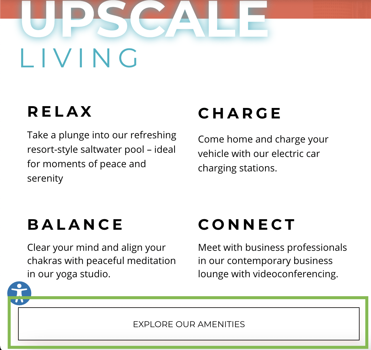
Similarly, if your content is describing amenities, then your button should direct to the amenities page. You don’t want to trick your website visitors by showing them a sneak peak of your amenities and then direct them to the application page. They may not be ready to apply yet, and they may even get discouraged and leave.
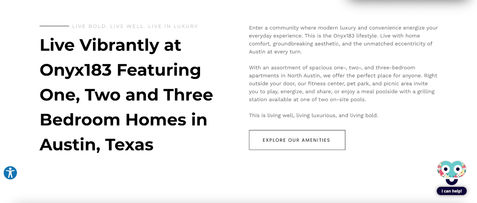
3. Sleek, Minimal Design
White space, a coherent color scheme, and only necessary page elements makes for great user experience. You want to create a focal point on the page that’s easy to find and draws people in.
This simple design makes very clear the main focus of the section: the floor plans. They’re large, clearly stated, and don’t have a bunch of other design elements overshadowing or overcomplicating them.

In this example from the same apartment website, the white space and all black text, as well as the button, are easy to read and not crowded by unnecessary design elements like pictures or more buttons. Website visitors can clearly see the text describing the community, the number of floor plans, the location, and they can view more amenities if they want.
4. Eye-Catching Apply Now and Resident Access Buttons
Your two most important groups of people are those that want to apply and those that are already renting with you. Making sure potential renters can easily apply and current residents can pay their rent should be a focus of your apartment website.
Include color-popping buttons at the top of the page or somewhere easily seen, just like in the example below.

5. Accented Colors in Important Spots
Using your most vibrant brand color to accent certain buttons, icons, links, and more can really help your visitors find exactly what they’re looking for, creating a good user experience right off the bat.
This website uses a pop of orange for their main button, which directs to the floor plans page. They also highlight the phone number and address with orange icons, as well as the menu button. These accented elements are the first things your visitors will notice when they land on your homepage, so make them count.
Want more examples of good user experience? Check out our TikTok!
Repli Apartment Marketing Blog
Subscribe to our Newsletter & Blogs
Blog Post Subscribe Form
Share Our Post!
Apartment Marketing Blog


2022 All rights reserved. Repli, Inc.