30 Attention-Grabbing CTAs for Your Property Website
Hey multifamily pros, let’s get real for a second. We all know the end game when it comes to online advertising—LEADS. But let’s face it, even with your trusty ILS listings and platforms like Facebook or Google Ads, you might still feel like you’re not quite hitting the mark on lead volume or quality. Sound familiar?
Well, here’s a little secret: if you’re raking in the clicks but not seeing those turn into solid leads, you’re missing a major piece of the puzzle. And guess what? It’s all about conversions.
💜 Don’t Just Chase Clicks—Capture Conversions
Sure, clicks and click-through rates are great, but if those clicks aren’t converting, you’re basically letting prime leads slip through your fingers. If you’re seeing high click-through rates but only a trickle of conversions, it’s time to shift gears and optimize for conversions.
There are tons of ways to do this, but one of the fastest and most effective strategies is mastering the art of the Call-to-Action (CTA). 🎯
What’s a CTA, Anyway? 🧐
A Call-to-Action (CTA) is that magic button or phrase that nudges your website visitors to take the next step. Whether you want them to schedule a tour, fill out a form, or pick up the phone, a strong CTA can make all the difference.
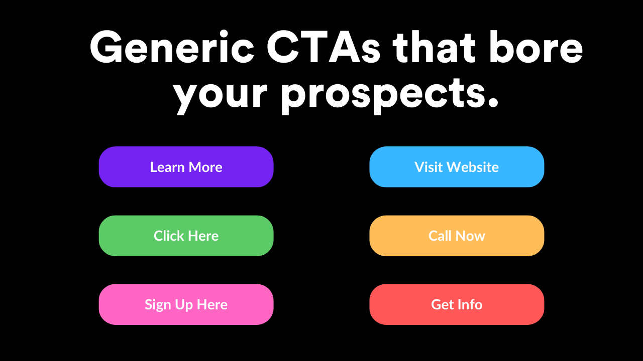
But here’s the kicker: the old “click here” just doesn’t cut it anymore. Your CTA needs to stand out, create urgency, and offer clear value to get your potential renters to act NOW.

👀 Nailing Your CTA: Tips to Turn Clicks into Leases
Ready to level up your CTAs? Here’s how to do it:
1. Know Your Audience & What You Want Them to Do
Got a bunch of leases expiring soon? Or maybe you’re just looking to keep your pipeline flowing? Tailor your CTA to match the specific action you want from your ideal audience.
🚨Pro Tip: If you’re in a lease-up crunch, try something like “Apply Today and Get a $20 Starbucks Gift Card!” 🎁
2. Use Action-Packed Verbs
“Click here” is so last decade. Instead, spice things up with verbs that inspire action. Think: “Schedule a Tour Now”, “Secure Your Spot”, or “Claim Your Move-In Special”. These not only engage but also excite!
3. Show the Value Upfront
Let’s be honest—nobody likes clicking a button without knowing what they’re getting in return. Whether it’s an exclusive offer, access to pricing, or a VIP tour, make it clear what’s in it for them. Keep it transparent, keep it honest, and watch your conversion rates soar. 📈
4. Align Your CTA with the Page Content
Your CTA needs to fit seamlessly into the context of your page. If you’re showcasing stunning amenities, then your CTA should match that vibe—like “See Floor Plans & Amenities Now”.
5. Design Matters: Make Your CTA Pop!
We get it—brand guidelines are important. But when it comes to your CTA button, it’s okay to break the mold a little. Use bright, contrasting colors that catch the eye and draw attention. Remember, if they can’t find the button, they’re not clicking it!
Steal These High-Impact CTAs to Boost Your Conversions Today 🔥
Here are some of our all-time favorite CTAs that get results. Use these on your website, landing pages, and ads to drive more traffic and turn clicks into leases:
- Apply Today
- Call Now for Exclusive Rates
- Check Availability
- Get First Month Free
- Join Our VIP List
- Lease Now – Limited Availability
- Schedule a Tour Today
- See Current Specials
- Request a Quote
- Reserve Your Unit Now
- Pick Your Perfect Floor Plan
- See The Virtual Tour
- Speak with a Leasing Specialist
- Take a Self-Guided Tour
- This Deal Ends Tonight
- View Pricing & Specials
Test, Tweak, Repeat
The best part? You don’t have to guess which CTA will hit the sweet spot. Try out different options, analyze what’s working, and double down on the winners. It’s all about finding what resonates with your audience and drives the highest quality leads.
So, ready to see your conversion rates take off? 🚀 It’s time to give those CTAs the upgrade they deserve!


